Architecture Overview
Introduction
Setup
Presenting products
Understanding prices
Managing checkout
Saleor CLI
ISR for E-Commerce
Real-time Search with Typesense
Displaying the Cart Content
So far, the checkout page that displays the cart's content is static. We hardcoded all the elements on the page to focus on its structure. In this section, we will connect the checkout object provided by Saleor with what's displayed on the screen when visiting the /cart route. This way, the cart page will dynamically render what's currently in the cart.
Getting the cart content from Saleor
The client uses the token to reference the checkout object associated with the current session. At any point in time, we can use this token to fetch the checkout content. Let's start with defining a query for that.
Let's name this mutation CheckoutFetchByToken and put it in graphql/queries/CheckoutFetchByToken.graphql:
# graphql/queries/CheckoutFetchByToken.graphql
query CheckoutFetchByToken($checkoutToken: UUID!) {
  checkout(token: $checkoutToken) {
    id
    email
    lines {
      id
      totalPrice {
        gross {
          amount
          currency
        }
      }
      variant {
        product {
          id
          name
          slug
          thumbnail {
            url
            alt
          }
        }
        pricing {
          price {
            gross {
              amount
              currency
            }
          }
        }
        name
      }
    }
    totalPrice {
      gross {
        amount
        currency
      }
    }
  }
}
Now we can incorporate this mutation into our application as a React Hook. Since we named our mutation CheckoutFetchByToken, the GraphQL Code Generator set to watch mode will automatically generate the useCheckoutFetchByToken hook.
Simplifying the checkout query using fragments
The checkout object is returned not only from the checkout query but also in response to various operations like adding or removing product variants that operate on that checkout. To avoid repeating the same query part in all those situations, we can use GraphQL Fragment. Fragments, as the name suggests, describe a part of the query and are identified by a name.
When creating a fragment, we start with a custom name followed by an existing GraphQL type. In this case, we will create a fragment on the Checkout. Put this GraphQL statement in graphql/fragments/CheckoutFragment.graphql:
# graphql/fragments/CheckoutFragment.graphql
fragment CheckoutFragment on Checkout {
  id
  email
  lines {
    id
    totalPrice {
      gross {
        amount
        currency
      }
    }
    variant {
      product {
        id
        name
        slug
        thumbnail {
          url
          alt
        }
      }
      pricing {
        price {
          gross {
            amount
            currency
          }
        }
      }
      name
    }
  }
  totalPrice {
    gross {
      amount
      currency
    }
  }
}
With this newly created fragment, we can now simplify and rewrite the CheckoutFetchByToken as follows:
# graphql/queries/CheckoutFetchByToken.graphql
query CheckoutFetchByToken($checkoutToken: UUID!) {
  checkout(token: $checkoutToken) {
    ...CheckoutFragment
  }
}
Displaying the cart
Let's update the pages/cart.tsx page. Whenever a user navigates to this page, we will check for the session, and if a session is available, we will ask the Saleor API for the checkout content.
// pages/cart.tsx
import React from "react";
import { useLocalStorage } from 'react-use';

import {
  Layout,
  CartHeader,
  CartList,
  CartSummary
} from "@/components";
import { useCheckoutFetchByTokenQuery } from "@/saleor/api";

const styles = {
  grid: 'grid grid-cols-3 gap-8',
}

const Cart = () => {
  const [token] = useLocalStorage('token');
  const { data, loading, error } = useCheckoutFetchByTokenQuery({
    variables: { checkoutToken: token },
    skip: !token,
  });

  if (loading) return <div>Loading...</div>;
  if (error) return <div>Error</div>;
  if (!data || !data.checkout) return null;

  const products = data.checkout?.lines || [];

  return (
    <Layout>
      <CartHeader />

      <div className={styles.grid}>
        <div className="col-span-2">
          <CartList products={products} />
        </div>
        <div>
          <CartSummary />
        </div>
      </div>
    </Layout>
  );
};

export default Cart;
As we pass the products list to CartList, we also need to adjust this component:
// components/CartList.tsx
import React from "react";
import Link from "next/link";

interface Props {
  products: any[];
}

const styles = {
  product: {
    image: "flex-shrink-0 bg-white w-48 h-48 border object-center object-cover",
    container: "ml-8 flex-1 flex flex-col justify-center",
    name: "text-xl font-bold",
  },
};

export const CartList = ({ products }: Props) => {
  return (
    <ul role="list" className="divide-y divide-gray-200">
      {products.map((line) => {
        const lineID = line?.id || "";
        const variant = line?.variant;
        const product = line?.variant.product;
        const price = line?.totalPrice?.gross;
        const productID = product?.id;

        return (
          <li key={line?.id} className="py-6 flex">
            <div className={styles.product.image}>
              <img
                src={product?.thumbnail?.url || ""}
                alt={product?.thumbnail?.alt || ""}
              />
            </div>

            <div className={styles.product.container}>
              <div className="flex justify-between">
                <div className="pr-6">
                  <h3 className={styles.product.name}>
                    <Link href={`/product/${productID}`}>
                      {product?.name}
                    </Link>
                  </h3>
                  <h4>{variant?.name}</h4>
                </div>

                <p className="text-xl text-gray-900 text-right">
                  {price?.amount} {price?.currency}
                </p>
              </div>
            </div>
          </li>
        );
      })}
    </ul>
  );
};
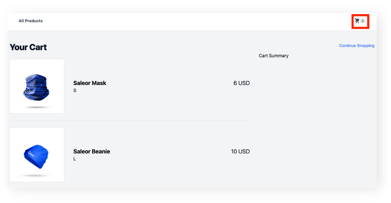
Adding Cart Icon in the Navbar
For a better user experience, let's add a cart icon in the navbar section that will link to the cart page. Next to the icon, we will also show the current number of items in the cart.
- Go to the
Navbar.tsxfile located incomponentsand adjust its contents as follows:
import React from "react";
import Link from "next/link";
import { CartIcon } from "./CartIcon";

const styles = {
  background: "bg-white shadow-sm",
  container: "max-w-7xl mx-auto px-8",
  menuSection: "flex justify-between w-full py-6",
  menuLink:
    "font-bold text-gray-700 hover:text-blue-400 z-10 flex items-center text-sm",
};

export const Navbar = () => {
  return (
    <div className={styles.background}>
      <div className={styles.container}>
        <div className={styles.menuSection}>
          <Link href="/" className={styles.menuLink} aria-expanded="false">
              All Products
          </Link>
          <CartIcon />
        </div>
      </div>
    </div>
  );
};
We have slightly adjusted the style on this page to take into account the newly <CartIcon /> component.
- In
componentsfolder create a new file calledCartIcon.tsxand copy/paste the code below:
import Link from "next/link";
import React from "react";

const styles = {
  menuLink:
    "font-bold text-gray-700 hover:text-blue-400 z-10 flex items-center text-sm",
};

export const CartIcon = () => {
  return (
    <Link href="/cart" className={styles.menuLink} aria-expanded="false">
        <svg
          xmlns="http://www.w3.org/2000/svg"
          className="w-5 h-5"
          viewBox="0 0 20 20"
          fill="currentColor"
        >
          <path d="M3 1a1 1 0 000 2h1.22l.305 1.222a.997.997 0 00.01.042l1.358 5.43-.893.892C3.74 11.846 4.632 14 6.414 14H15a1 1 0 000-2H6.414l1-1H14a1 1 0 00.894-.553l3-6A1 1 0 0017 3H6.28l-.31-1.243A1 1 0 005 1H3zM16 16.5a1.5 1.5 0 11-3 0 1.5 1.5 0 013 0zM6.5 18a1.5 1.5 0 100-3 1.5 1.5 0 000 3z" />
        </svg>
    </Link>
  );
};
In this component, we use an svg cart icon from Heroicons, which is wrapped into a <Link> leading to the cart page.
- Let's now add the information about the number of items in the cart. We will display it next to the icon. Open the
CartIconcomponent and update its contents:
import Link from "next/link";
import React from "react";
import { useLocalStorage } from "react-use";
import { useCheckoutFetchByTokenQuery } from "@/saleor/api";

const styles = {
  menuCartLink:
    "font-bold text-gray-700 hover:text-blue-400 z-10 flex items-center text-sm",
  menuCartItemsNumber:
    "text-neutral-700 px-1.5 tracking-tight text-xs rounded-full bg-neutral-200",
};

export const CartIcon = () => {
  const [token] = useLocalStorage("token");
  const { data, loading, error } = useCheckoutFetchByTokenQuery({
    variables: { checkoutToken: token },
    skip: !token,
  });

  const products = data?.checkout?.lines || [];
  return (
    <div className="flex items-center pl-4">
      <Link href="/cart" className={styles.menuCartLink} aria-expanded="false">
          <svg
            xmlns="http://www.w3.org/2000/svg"
            className="w-5 h-5"
            viewBox="0 0 20 20"
            fill="currentColor"
          >
            <path d="M3 1a1 1 0 000 2h1.22l.305 1.222a.997.997 0 00.01.042l1.358 5.43-.893.892C3.74 11.846 4.632 14 6.414 14H15a1 1 0 000-2H6.414l1-1H14a1 1 0 00.894-.553l3-6A1 1 0 0017 3H6.28l-.31-1.243A1 1 0 005 1H3zM16 16.5a1.5 1.5 0 11-3 0 1.5 1.5 0 013 0zM6.5 18a1.5 1.5 0 100-3 1.5 1.5 0 000 3z" />
          </svg>
      </Link>
      <div className={products.length > 0 ? styles.menuCartItemsNumber : "hidden"}>
        {products.length > 0 && products.length}
      </div>
    </div>
  );
};
For simplicity's sake, we reused the useCheckoutFetchByTokenQuery to fetch the number of products and rendered the number on the right side of the icon. You can now test the functionality by adding a random number of products to the cart: