
Architecture Overview
Introduction
Setup
Presenting products
Understanding prices
Managing checkout
Saleor CLI
ISR for E-Commerce
Real-time Search with Typesense
Creating Search UI
In this part, we'll use the newly created Typesense collection to build an effective search UI with Instant Search library provided by Algolia.
Setting up Instant Search
In order to use the functionality of instantSearch.js we need to install a couple of things:
- React InstantSearch with types
- Typesense-instantsearch-adapter
- In the terminal run:
pnpm add react-instantsearch-dom
pnpm add @types/react-instantsearch-dom
pnpm add -D typesense-instantsearch-adapter
After a successful install, we need to connect the search client to Typescript server. Go to the main page in index.tsx in the pages folder and add the configuration for searchClient:
const typesenseInstantsearchAdapter = new TypesenseInstantSearchAdapter({
  server: {
    apiKey: "YOUR SEARCH ONLY API KEY", // Be sure to use an API key that only allows search operations
    nodes: [
      {
        host: "xxx.a1.typesense.net", // take it from your Typesense Cloud
        port: 443,
        protocol: "https",
      },
    ],
    cacheSearchResultsForSeconds: 2 * 60, // Cache search results from server. Defaults to 2 minutes. Set to 0 to disable caching.
  },
  additionalSearchParameters: {
    query_by: "name, category",
  },
});
const searchClient = typesenseInstantsearchAdapter.searchClient;
We are now connected to Typesense server and ready to build the search UI.
Adding the first widget

- Go to
index.tsxand inspect the code responsible for rendering the products view.
...
<div  className="py-10">
  <header  className="mb-4">
    <div  className="px-8 mx-auto max-w-7xl">
      <h1  className="text-3xl font-bold leading-tight text-gray-900">
      Dashboard
      </h1>
    </div>
  </header>
  <main>
    <div  className="px-8 mx-auto max-w-7xl">
      <Products  />
    </div>
  </main>
</div>
...
Inside the main tag, there is a custom React component <Products /> which is responsible for rendering the list of all the products. In our search UI we want to change this behaviour so that only the products that are the result of the search are rendered. For this purpose we are going to implement our first search component from Instant Search Library called the <SearchBar />.
- Add the Instant Search root widget to the existing code and the
<aside>tag which we will need in the next steps.
...
</header>
<InstantSearch  indexName="products" searchClient={searchClient}>
  <div>
    <aside></aside>
    <main>
    <div className="px-8 mx-auto max-w-7xl">
      <Products  />
    </div>
    </main>
  </div>
</InstantSearch>
...
The root widget is responsible for communication between our application and Typesense. It wraps all the other React InstantSearch components. It takes in the name of our collection and the searchClient instance as attributes.
- Add the
<SearchBox />in themainsection of the page.
<div className="px-8 mx-auto max-w-7xl">
  <div className="mb-8">
    <SearchBox />
  </div>
  <Hits hitComponent={Hit} />
</div>
- Change
<Products />to<Hits />.
This widget is responsible for displaying the results of a given search. <Hits /> takes a component as an attribute which is responsible for rendering a single product.
- Create a
<Hit />component. The example component may look like that:
type Props = { hit: any };

const Hit = ({ hit }: Props) => {
  return (
    <div className="w-full bg-white ">
      <div className="block bg-white">
        <Image
          src={hit.imageSrc}
          layout="responsive"
          width={16}
          height={9}
          objectFit="contain"
          alt={hit.name}
        />
      </div>
      <div className="p-2 border-t border-gray-100">
        <p className="truncate">{hit.name}</p>
        <p className="block text-sm font-medium text-gray-500">
          {hit.category}
        </p>
        <p className="py-4 font-bold text-md">{hit.price}</p>
      </div>
    </div>
  );
};
export default Hit;
- Add the
vercel.saleor.clouddomain to the images source innext.config.js.
next.config.js
module.exports = {
  reactStrictMode: true,
  images: {
    domains: ["vercel.saleor.cloud"],
  },
  formats: ["image/avif", "image/webp"],
};
After restarting the server we should have our search box ready and functional on the page.
Adding more widgets
Hence, we will implement:
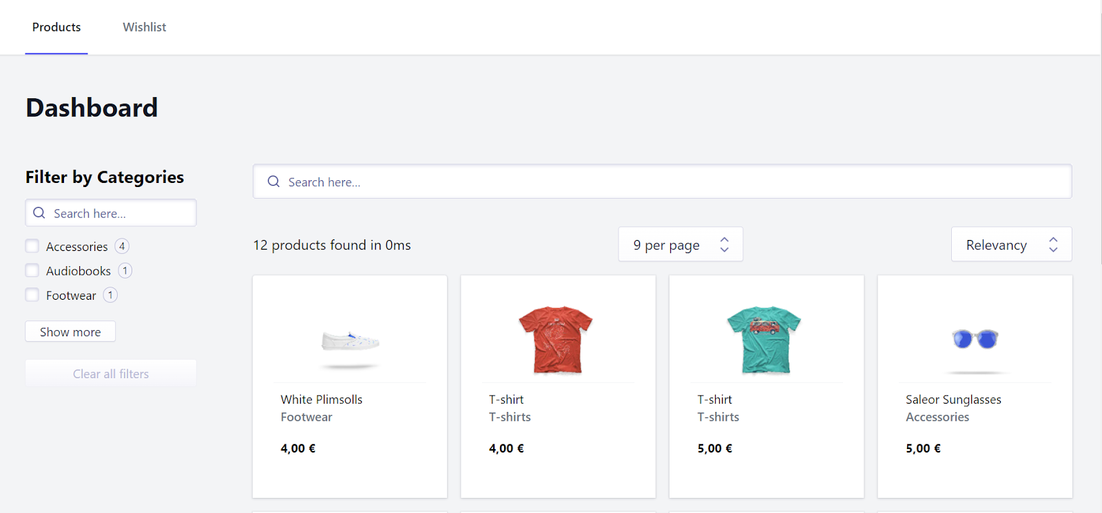
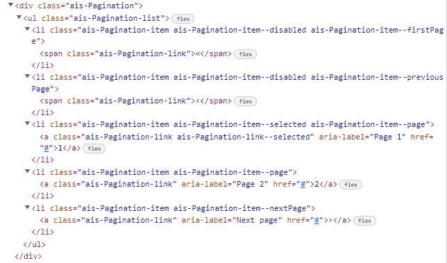
<RefinementList/>for filtering by Categories<Stats />that show the number of products found<HitsPerPage />which enables us to limit the number of results on the page<SortBy />to be able to arrange the products according to their price<Pagination />to divide the results of the search into separate pages<ClearRefinements />to clear all the filters
We will start adding the components from the <aside>.
...
<div className="flex justify-between gap-16 px-8">
  <aside className="pt-8 max-w-fit">
    <h3 className="text-xl font-bold">Filter by Categories</h3>
    <RefinementList
      className="mt-3"
      attribute="category"
      limit={3}
      showMore={true}
      showMoreLimit={10}
      searchable={true}
      transformItems={(items: any[]) =>
      items.sort((a, b) => (a.label > b.label ? 1 : -1))
      }
    />
    <ClearRefinements  className="mt-5"  />
  </aside>
...
The <RefinementList /> component is largely customizable; it takes in the name of the collection ad enables us to set the look and feel of the component. In the transformItems attribute we can pass in a function - here, to sort the categories alphabetically.
Next, let us deal with the <main> section:
<main className="flex flex-col items-center self-center w-full">
  <div className="w-full my-8">
    <div className="mb-8">
      <SearchBox />
    </div>
    <div className="flex items-center justify-between mb-4">
      <Stats
        translations={{
          stats(nbHits, processingTimeMS) {
            let hitCountPhrase;
            if (nbHits === 0) {
              hitCountPhrase = "No products";
            } else if (nbHits === 1) {
              hitCountPhrase = "1 product";
            } else {
              hitCountPhrase = `${nbHits.toLocaleString()} products`;
            }
            return `${hitCountPhrase} found in ${processingTimeMS.toLocaleString()}ms`;
          },
        }}
      />
      <HitsPerPage
        className="ms-4"
        items={[
          { label: "9 per page", value: 9 },
          { label: "18 per page", value: 18 },
        ]}
        defaultRefinement={9}
      />
      <SortBy
        items={[
          { label: "Relevancy", value: "products" },
          { label: "Price (asc)", value: "products/sort/price:asc" },
          { label: "Price (desc)", value: "products/sort/price:desc" },
        ]}
        defaultRefinement="products"
      />
    </div>
    <Hits hitComponent={Hit} />
  </div>
  <Pagination />
</main>
Each of the widgets takes in specific attributes which are described in detail in the Algolia's Instant Search docs. Hence, we will not focus on these. For now, we have all the components we need to make a pretty nice search UI. The last thing to tackle with is the styling.
Styling the widgets
The library doesn't load any CSS by default but it is possible to manually install a theme. There are two avaliable:
reset.csssatellite.css
Reset.css is a bare minimum that is recommended, satellite.css ships with a lot more style. You can use either of them. In oder to install the theme run:
pnpm add instantsearch.css -D style-loader css-loader
Then import the theme in your component:
import "instantsearch.css/themes/reset.css";
//or
import "instantsearch.css/themes/satellite.css";
You can customise the styling using the respective css classes, like so:
.ais-SearchBox-submitIcon path,
.ais-SearchBox-resetIcon path {
  fill: red;
}
The HTML output with its respective CSS classes of every widget used by react-instantsearch-dom is available in Algolia's Api Reference.